The 3 second rule in web design states that visitors decide whether to stay on a website or leave within 3 seconds of landing. In that short window, users judge the site’s load speed, visual clarity, and relevance to their search intent. If the page fails any of these, bounce rates rise sharply and conversions drop.
Key Takeaways
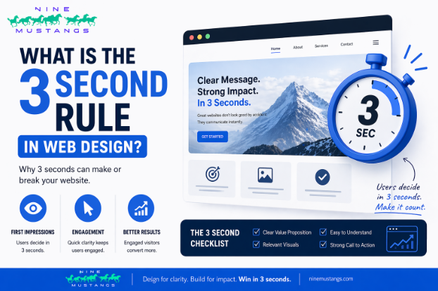
- The 3 second rule means visitors decide to stay or leave within 3 seconds, based on load speed, relevance to their search intent, and credibility.
- Google research shows 53% of mobile users abandon a page that takes longer than 3 seconds to load, and every additional second of load time reduces conversion by roughly 7%.
- Passing the 3 second test depends on six elements working together: a clear value proposition, fast load speed, visual hierarchy, familiar navigation, an obvious call to action, and mobile first responsive design.
- The most common failure point is unclear messaging, not slow loading. Visitors leave because they cannot tell what the business does, even when the page renders quickly.
- Mobile traffic now exceeds 60% of total web traffic, which makes mobile performance the default benchmark for every 3 second test.
3 Second Rule in Web Design
Every business website is fighting the same battle: keeping visitors on the page long enough to care. The 3 second rule reflects real user behavior documented by Google, Amazon, and Akamai, and the consequences of ignoring it have only grown as mobile usage climbed and user patience shrank.
This guide explains what the rule actually means in 2026, why it still governs website performance, and exactly which design and technical choices decide whether your site clears the window or loses the visitor. You will also see the specific fixes that matter most for business websites today.
What is the 3 second rule in web design?
The 3 second rule refers to the narrow window visitors give a website before deciding whether to stay. It covers three judgments a user makes almost simultaneously when a page loads.
The three judgments users make in 3 seconds
When a visitor lands on a website, the brain processes three things at once, and all three need to pass for the visit to continue.
- Can I see something? This is the load speed judgment. If the page has not produced meaningful content within 2.5 to 3 seconds, users reach for the back button before anything finishes rendering.
- Is this what I wanted? This is the relevance judgment. Within a second of seeing the page, users compare what they see against what they searched for. A mismatch between search intent and page content triggers an immediate exit.
- Do I trust this? This is the credibility judgment. Visual design, typography, layout quality, and overall polish create an instant impression of whether the business is legitimate and worth engaging with.
Where the rule comes from
The 3 second threshold is grounded in well documented web performance research. Google found that 53% of mobile users abandon a page that takes longer than 3 seconds to load. Akamai reported that a 2 second delay in page load time increases bounce rates by 103%. Amazon’s internal analysis, first shared publicly by engineer Greg Linden, showed that every 100 milliseconds of additional load time costs the company roughly 1% in sales. The number 3 is not arbitrary. It sits at the edge of human patience for digital interactions and has been validated across thousands of sites and billions of sessions.
Why it matters more in 2026
Mobile browsing now accounts for more than 60% of all web traffic globally. Mobile users have shorter sessions, slower connections on average, and less tolerance for friction than desktop users. Google’s Core Web Vitals are a confirmed ranking signal, meaning sites that miss the 3 second window also lose visibility in search results. AI answer boxes and featured snippets have trained users to expect information instantly, which raises the bar for what counts as an acceptable page experience.
The psychology behind the 3 second rule
The rule works because it aligns with how attention actually functions online. Design teams that understand the underlying psychology build better websites than teams chasing performance scores in isolation.
How first impressions form online
A first impression online is formed before the conscious mind engages with the content. Users process visual information, judge color and layout, and make preliminary trust decisions within a few hundred milliseconds of the page rendering. Research from the Nielsen Norman Group has shown that users abandon pages they find visually unclear almost as quickly as pages that load slowly, which is why design clarity and technical speed both matter.
Cognitive load and decision fatigue
Every extra element on a page adds to the visitor’s cognitive load. When a page forces users to process too many competing signals at once, the brain defaults to the easiest action available, which is usually leaving. Simple, focused pages outperform cluttered ones in almost every measurable metric, from bounce rate to time on site to conversion.
The Doherty Threshold
In 1982, IBM researcher Walter Doherty established that users interact more productively with systems that respond in under 400 milliseconds. The 3 second rule extends that principle to full page experiences. When a website responds within the Doherty Threshold for interactions and loads content within 3 seconds overall, users enter a state of engagement rather than frustration.
How to pass the 3 second test: the design checklist
The 3 second rule is not a single fix. It is a set of design, technical, and content decisions that combine to create a first impression strong enough to earn a second click. The table below summarises the six elements that matter most for business websites.
| Design Element | Why It Matters | How To Fix It |
|---|---|---|
| Clear value proposition above the fold | Tells visitors what you offer within 3 seconds | Rewrite your headline to answer three questions: what you do, who you do it for, and what outcome you deliver |
| Fast loading speed under 2.5 seconds | A 1 second delay drops conversions by 7% | Compress images, enable browser caching, use a CDN, reduce third party scripts |
| Clean visual hierarchy | Guides the eye to what matters most first | Use size, contrast, and whitespace to rank importance on every page |
| Recognisable navigation | Reduces cognitive load during the first scan | Use standard menu placement and plain language labels |
| Obvious primary call to action | Tells visitors exactly what to do next | Contrasting button, action oriented copy, visible above the fold |
| Mobile first responsive layout | Over 60% of web traffic is mobile in 2026 | Test every breakpoint and prioritise thumb reach zones |
Design for instant clarity
The most common reason a website fails the 3 second test is not speed. It is confusion. Visitors land on a page and cannot immediately tell what the business does, who it serves, or why they should care. A clear value proposition, placed above the fold and written in plain language, answers these three questions in one glance. Clever headlines cost you traffic. Clear ones keep it.
Prioritise page load speed
Technical performance is the foundation everything else sits on. If the page has not loaded, no amount of good design matters. Core Web Vitals scores, image compression, browser caching, CDN usage, and front end code efficiency all contribute to measurable load time. Most business websites can cut their load time in half with basic optimisation that does not require a full redesign. Google PageSpeed Insights and GTmetrix make this diagnosis free and fast.
Build visual hierarchy that guides attention
Human eyes follow predictable patterns when scanning a page. Most users in left to right reading cultures scan in an F pattern or Z pattern, moving from top left across and down. Effective visual hierarchy places the most important elements along these scanning paths: the headline at the top, the key benefit next, the call to action in a position the eye naturally returns to. Random placement of elements forces the brain to work harder, and harder usually means leaving.
Common mistakes that break the 3 second rule
Most business websites fail the 3 second test for a small set of repeatable reasons. Each one has a direct fix.
Oversized hero images and video backgrounds
A cinematic hero image or autoplay video feels premium at the design stage. On a live site, it is often the single biggest contributor to slow load times and high bounce rates. Hero media should be compressed, lazy loaded where possible, and never the reason a user waits more than a second to see the page’s primary message. If the video does not directly contribute to conversion, it probably does not belong on the home page at all.
Vague or clever headlines
A headline that makes a visitor stop and work out what the business does is a headline that is losing business. The first sentence on a website should not require interpretation. Clever wordplay, industry jargon, and marketing slogans slow understanding and push visitors closer to the back button. The best website headlines sound almost boring, because clarity is rarely exciting but it always converts.
Pop-ups that interrupt before engagement
A newsletter signup that triggers before the visitor has read a single line is the digital equivalent of being asked for an email at the door of a shop you just walked into. Pop-ups have their place in conversion strategy, but the timing matters enormously. Triggering them on exit intent, or after a visitor has scrolled or spent meaningful time on the page, produces far better results than triggering them on arrival.
Unclear or hidden calls to action
Visitors who cannot immediately see what they are supposed to do next will not go looking for it. The primary call to action should be visible above the fold, use contrasting color, use action oriented language, and reappear at natural decision points throughout the page. A website with five competing calls to action effectively has no call to action at all.
How Nine Mustangs approaches the 3 second rule
Every website we design at Nine Mustangs starts with one question: what does the visitor need to understand, feel, and decide within the first 3 seconds? Every element on the page is evaluated against that question. If it does not help the visitor pass the test, it does not make the cut.
This approach brings together our core services. SEO ensures the right visitors arrive in the first place. Web design earns their attention once they do. Content strategy matches the message to their search intent. Branding builds credibility rather than confusion from the first render. A website that performs is one where all four are working together instead of being treated as separate projects.
Contact us For Free Web Design Audit of Your Website
Frequently asked questions
These questions cover topics that sit outside the core 3 second rule but come up often when business owners start applying it.
Does website hosting affect whether a site passes the 3 second rule?
Yes, significantly. Shared hosting plans from budget providers often add 1 to 3 seconds to server response times during traffic spikes, which alone can push a site past the 3 second threshold regardless of how well it is designed. Managed hosting, VPS plans, and modern serverless platforms like Vercel, Cloudflare Pages, and WP Engine deliver consistently faster response times. For a business website where conversions matter, hosting is one of the cheapest performance upgrades available, usually for an additional £15 to £40 per month.
How does the 3 second rule apply differently on mobile and desktop?
Desktop users tend to give a site slightly more patience because they often have faster connections and a larger viewport that makes value clearer at a glance. Mobile users are less forgiving. They expect instant loading on 4G and 5G networks, their screens force tougher prioritisation decisions, and their context is usually time sensitive. In practice, the 3 second rule is really a mobile rule, and a site that passes on mobile will almost always pass on desktop as well. The reverse is not true.
Should I use a website builder or a custom built site for better 3 second performance?
Both can work, and both can fail. Modern builders like Webflow, Framer, and Squarespace produce sites that pass the 3 second test when configured well and kept lean. WordPress can also perform strongly with quality hosting and disciplined theme and plugin choices. The failure pattern in either case is the same: too many fonts, too many third party scripts, unoptimised images, and heavy page builders stacked on top of each other. A custom coded site tends to perform best in the hands of a specialist, but paying more for custom code does not guarantee speed if the underlying decisions are still poor.
How often should I retest my website’s 3 second performance?
Monthly at a minimum, and always after any significant change. Adding a new plugin, updating a theme, embedding a new marketing script, or uploading large images can quietly slow a site that used to pass. Many businesses discover their website has degraded only when traffic drops or conversions decline, which is usually months after the damage started. A simple monthly check using Google PageSpeed Insights plus a real user session tool like Microsoft Clarity catches most issues before they cost revenue.
Does adding more pages or blog content slow my website down over time?
Not directly. A website with 500 pages loads individual pages at exactly the same speed as a site with 50, because only the visited page is downloaded. What does slow a growing site down is the accumulation of plugins, tracking scripts, and media over time, along with database bloat on older WordPress sites. Regular audits to remove unused plugins, compress older images, and clean up the database preserve performance as the site grows. Publishing more content is good for SEO and rarely a speed problem on its own.
Is your website passing the 3 second test?
Many business websites lose a significant share of their traffic inside the first 3 seconds without the owner noticing. A proper audit of homepage performance, messaging clarity, and mobile experience is usually the difference between a site that generates leads and one that quietly costs them.
Nine Mustangs builds business websites designed to clear the 3 second test from the first render, combining SEO, web design, content strategy, and branding as one integrated system rather than separate projects.